There are conventions to website design.
Conventions are set ways of doing things. They aren’t laws or rules, but rather guidelines that have evolved over time to make the user experience easier, regardless of which website they are visiting. For example, a common convention on a website is to place the search box in the top-right corner. It’s not a legal requirement, but web users are used to finding it there, so this has developed as a convention - common practice. Another convention is to place legal information (e.g. the disclaimer or copyright details) in the footer.
Steve Krug in his awesome book “Don’t make me think” explains that conventions aren’t unique to website design. Take for example, reading a newspaper:
“...a phrase in very large type is usually a headline that summarizes the story underneath it, and that text underneath a picture is either a caption that tells me what it’s a picture of, or - if it’s in very small type - a photo credit that tells me who took the picture” (page 34).
Conventions are your friends
But they aren’t always followed, and this can be confusing. Take for example my recent visit to the Matthias Media website. On the homepage is a form to sign-up for their monthly enewsletter. This is a great service to offer to website visitors. But it’s confusing - take a look:
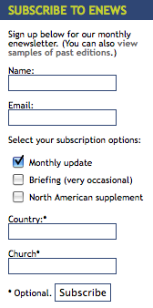
When I first glanced at this form, I began to write a post questioning the need for so much information from the visitor, simply to sign-up for the e-newsletter. Over-asking is a major gripe of mine! I assumed they were over-asking because of the use of the asterisk (*) above several of the fields. In website design, an asterisk is a convention used to indicate required information.
Yet at the bottom of the form is an explanation - the * in this instance, indicates that the field is optional. It’s good to have this explanation, but to avoid confusion it would be much easier to stick to conventions and just use the * to indicate the information that’s required (i.e. the email address).
I also tried to sign-up for more information about AngliConnect . To be honest, I wasn't exactly sure what AngliConnect was, but it had been recommended as a service I should check-out, so I paid it a visit last week. Below is the sign-up form I needed to complete:
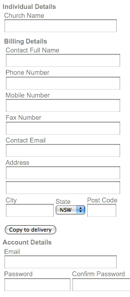
However, none of the fields are indicated as ‘required’ (i.e. no * or other explanation). So in terms of web conventions, I shouldn’t need to add any information to any of the fields. Yet, when I submitted the form without my mobile number, an error message appeared, explaining that I needed to include this. Not only wasn’t I told that the mobile number was necessary, I couldn’t understand why I would need to provide two phone numbers. Of course, when you are creating a form it’s your prerogative to request whatever information you like. Just be aware that the more you ask, and the more complex and less conventional the process, the more frustrating this is for the user, and the greater potential for the user to just walk (or click) away.
My intention isn’t to single out Matthias Media or AngliConnect. All of our church and ministry websites are a work in process. My intention is to affirm that conventions are our friends. Learn them (by visiting other websites or reading great books like ‘Don’t make me think’) but, unlike our friends, use them. It will make the experience of visitors to your site easier, and less confusing.
Win a copy of 'Don't make me think'!
 'Don't make me think' should be essential reading for anyone designing a website. If people can't use your website, they won't. The author, Steve Krug is a usability expert who shares his insights into how people use websites, and practical techniques for building and fine-tuning websites that people will find easy to use. The book is an easy read for anyone (i.e. you don't need to be tech-savvy to get it!) and for a book about websites, it's refreshingly amusing too!
Thanks to Pearson Australia, we have five copies of 'Don't make me think' to give away. To enter, simply post a comment on this article. Five winners will be drawn at random. This give away is only open to people with postal addresses in Australia.


